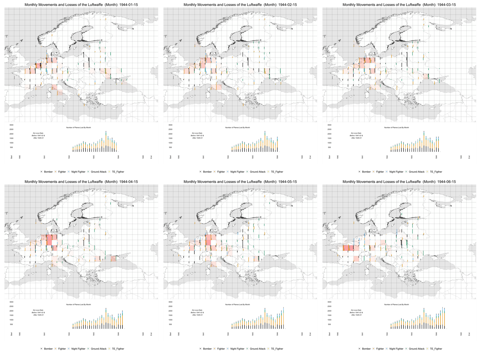
I created this infographic where you can see the monthly locations, movements, and for the middle of the war losses of the German Air Force in WWII. I cut the map into 2 latitude by 2 longitude squares and counted the number of aircraft within that square. I then color coded it by different type of aircraft. In the lower left of each square are the number of fighters (these include single engine, twine engine, and night fighters) and in the upper right of each square there are the number of bombers (either ground attack or general bombers).
Before February 1942 I estimate the sizes of groups as the data for number of planes are not available before than. Each vertical line heigh shows the number of planes maxing out at 100 before flowing over into subsequent lines. There can be 10 lines each representing a max of 1000. Starting February 1942 through December 1944 we not only have accurate data on the monthly number of planes at each location but we also see the monthly losses during that time period as well.
In order to visualize the movements and losses I based the graphic as if the data came from a turned-based strategy game. Here I visualize two phases; a movement phase followed by a ‘battle phase’ which consists of two additions to the original visualization showed. 1) the hot spots of the war and 2) the planes destroyed fall off into place in this time series plot at the bottom.
The full infographic can be found on YouTube (I cannot load the entire GIF on blogger). All data collection, formatting, and plotting was done in R.
Luftwaffe Data came from ww2.dk
and Map data came from here
Code can be found here: https://github.com/samcarlos/luftwaffe_locations
For further information on this graphic please see this presentation

No comments:
Post a Comment