Thursday, September 5, 2013

Car Magazine Hot Hatch Hall of Fame Graphs


Car Magazine's June 2013 issue picked 17 of the "greatest hot hatches of all time" and included specs. Unfortanely they didn't include any graphs of numbers to see how hot hatches developed through time, so I took it upon myself as a civic duty (my way of giving back to the community) to display the numbers in graphs. I also included weight for each car (in lbs of course) and UK CPI index to find the real value of prices of cars sold when new.


Steady decline in 0-60 times throughout the years. The Peugoet 106 Rallye had the slowest time of all at 10.3 seconds and was sold between 1994 - 1998.  I've seen reported times for the Pug at 8.3 seconds so this might be a typo, then again it only has 100 bhp so its not going to be a speed demon...

Interestingly, some of the quickest hot hatches were sold in the late 1980's and early 1990's. These included the Lancia Delta Integrale (5.7 sec), Ford Escort Cosworth (6.2 sec), and Nissan Sunny GTI-R (6.1 sec). A plausible reason for the quickness of these cars was that all had AWD and therefore had more traction off the line to accelerate quickly.

 Above graph is Real Price when the car was new in 2009 Pounds. The real price of the Delta Integrale, Sunny GTI-R, and Ford Escort Cosworth are all relatively more expensive in real terms. However, the high cost of those cars was probably because of the very high performance for their time (and today's time, look at 0-60 mph).

Very generally cars go through life stages. When new they look bold and modern. When slightly old (5-10 years) they look dated and their faults are well known. But something interesting happens to cars after about 10 years: they start to look cool again and they are appreciated more. I wanted to see if this U-shaped "lifecycle" is present in the price data. To compare cars and their particular life cycle stage I divided the Real cost when new by the current cost today and plotted those values against time. The resulting figure is shown above. In some sense the U is there: a cars value relative to its initial real price declines for the first 10-15 years and then increases again. 

Looking at this graph, I'm thinking maybe I should buy a Puegeot 306 GTi-6. After all even now its performance are up to par with modern cars. In addition, its at the trough of the coolness curve so it might appreciate in value.


 Above two graphs show the what RPM the maximum horsepower and maximum torque occurs at for each car. The color is categorized by whether the car is turbocharged or not. Both graphs show that naturally aspirated cars increase RPM through time while turbocharged engines reduce RPM.

I'm kind of puzzled by this. Obviously to get more HP out of a naturally aspirated engine one needs to increase the rev range and should work in principle for Turbos. However, turbocharged engines seem to be taking a different route and are able to get the performance that surpasses that of a naturally aspirated engine but at a much (and continuously lower) rev band.


 Most engines are at 2 liters and doesn't appear to be a strong trend.

 Maximum Speed shows a strong trend by time.

Data and R Code:

https://docs.google.com/file/d/0B9nc4zDDl2T-S211amdzVkpoUk0/edit?usp=sharing
https://docs.google.com/file/d/0B9nc4zDDl2T-eE54aV9GYkhlclU/edit?usp=sharing

Thursday, May 23, 2013

Can Nissan Double It's Sales in by 2017?

Carlos Ghosn announced the Nissan's sales target to double by 2017. Is this a reasonable target?

Using data from Wards Auto, I  fifth difference in percent (X(t)-X(t-5))/X(t-5) and saw between 1963 and 2012 what companies actually increased sales by at least 100%.

The last company to accomplish such a feat in 5 years was Hyundai between 1998 and 2002. Increasing from 0.57% market share to 2.19% Market share and corresponding sales increase from 91,000 to 375,000.

Nissan achieved the goal between 1969-1973 with sales increasing from 0.79% to 2.19% market share and sales went from 91,000 to 319,000.

It's pretty obvious that doubling sales when sales are initially at a low level is fairly easy. So I looked what was the starting largest Market Share / yearly sales of companies at the beginning of period that achieved double growht. Honda started with 0.92% market share and 102,000 sales in 1979 (the largest number of raw sales that at least doubled in 5 years) while Hyundai started out 113,000 sales and 0.73% market share in 1997. These were the largest increased in 5 years.

Compare those numbers with current Nissan sales/ market share of over 1.1 million and 7.72%. Doubling sales of this magnitude has never been achieved, ever. I don't think Nissan can pull it off.

Friday, May 17, 2013

What cars should be faster/slower around EVO's racetrack?

Lap times are dependent on such variables as horsepower and weight. More horsepower will correspond to a faster lap time while more weight will lead to a slower lap time. However, there are many other variables not in the specs that can effect the lap time. For example; some cars are hard to handle on the limit and will make the driver cautious / slower around the track. Conversely a more confidence inspiring car will make the driver push the car to its limits and have a quicker lap time. Other factors such as; steering feel, power delivery, weight transfer through the corners, etc. will effect the lap time to a degree that the specs of a car do not.

What cars should be faster or slower on a racetrack given their own specifications?

Using EVO Lap times and variables including; Number of Cylinders, RPM @ max RPM, HP, RPM @ max LBFT, LBFT, Engine Size, and Weight, I made a regression model and looked at those that over/underperformed given the model.

This then, is just looking at the residuals and seeing what cars should be better. This may sound stupid at first. After all no one says "Well..yea you're car is 5 seconds faster, but it really should be 10 seconds faster!". Then again most of comparisons involve residuals. Whenever anyone says "Good for the price" they're talking residuals given a price. Here I'm talking residuals given HP and Weight figures.


Below are the cars and how fast they went around the EVO lap in seconds. (Other data can be found here)


Car
Lap Time
Ferrari 458 Italia
79.3
Caterham Levante VS
79.6
Porsche 997 GT2 RS
79.9
Lotus 2-Eleven GT4
80.1
Caterham Superlight R500
80.2
McLaren MP4-12C
80.6
Noble M600
80.8
Porsche 997 GT3 RS 4.0
81
Lamborghini Murcielago LP670-4 SV
81.3
Ariel Atom 3 Supercharged
81.5
KTM X-Bow (300bhp)
81.5
Ferrari 430 Scuderia
81.7
Porsche 997.2 CT3 RS (3.8)
81.9
Brooke Double R
82.5
Lamborghini Gallard LP560-4
82.5
Lamborghini Murcielago LP640
82.9
Porsche 997.2 GT3
83.3
Porsche Carrera GT
83.3
Porsche 997 Turbo S
83.5
Nissan GT-R
83.6
Lotus 340R (190bhp)
84.2
Caterham Superlight R300
84.3
Maserati GranTurismo MC Stradale
84.5
Mercedes-Benz SLS AMG
84.6
Porsche Boxster Spyder
84.7
Ferrari California
85
KTM X-Bow
85
BMW E92 M3 Coupe
85.1
Mercedes-Benz SL65 AMG Black
85.2
Audi RS5
85.4
Audi R8 Spyder V8
85.5
Porsche Cayman R
85.5
BMW M5 (F10)
85.7
Aston Martin V12 Vantage
85.8
BMW 1-series M Coupe
85.9
Mitsubishi Evo X FQ-400
85.9
Mitsubishi Evo X RS 360
86.1
Renaultsport Megane 265 Trophy
86.1
Audi TT RS
86.3
Aston Martin DBS
86.4
Porsche Panamera Turbo
86.5
Jaguar XJ220
86.7
Mercedes-Benz E63 AMG
86.8
Porsche Cayenne Turbo
86.9
Lotus Evora
87.1
Nissan 370Z
87.1
Porsche Panamera S
87.3
Lotus Elise SC
87.7
Mercedes-Benz C63 AMG Coupe
87.7
BMW E46 M3 C5L
87.8
Renaultsport Megane R26.R
87.8
Vauxhall VXR8 Bathurst S
87.8
Audi RS6 Avant
87.9
Jaguar XFR
87.9
Honda Civic Type-R Mugen 2.0
88
Lexus IS-F
88.1
Porsche Boxster S
88.1
Subaru WRX STI
88.3
Jaguar XJ Supersport
88.4
SEAT Leon Cupra R
88.7
Bentley Continental Supersports
89.2
Lotus Elise Club Racer
89.2
Maserati Quattroporte S
89.5
Renaultsport Megane 250 Cup
89.9
Honda NSX
90.1
Nissan 370Z Roadster
90.3
VW Scirocco 2.0 TSI
90.4
Ford Focus RS (Mk2)
90.8
Renaultsport Clio 200 Cup
91.9
VW Golf GTI [Mk6)
92.4


Below is a Pairs Plot of each of variables.


I ran a step regression with Lap Time as dependent and all other variables (excluding weather since there all except 3 were Dry). The process lead to a model including; HPRPM, Engine Size, BHP, and Weight and is shown below. 

Coefficients: Estimate Std. Error t value pvalue
(Intercept) 88.2097659 2.1478362 41.069 approx zero
hprpm -0.0005044 0.0002497 -2.02 0.0475
CubicCenti 0.0003122 0.0002945 1.06 0.293
Bhp -0.0207499 0.0027082 -7.662 1.16E-10
Weight 0.0056975 0.0008757 6.506 1.28E-08


Residual standard error: 1.974 on 67 degrees of freedom
Multiple R-quared: 0.6635 ADJ R-squared:0.6435
F-statistic:33.03 on 4 and 67 DF


Using this model the residuals

Car Residual
KTM X-Bow (300bhp) -2.93487945
Lotus 2-Eleven GT4 -2.83245965
Nissan GT-R -2.66665528
Ferrari 458 Italia -2.57420938
Porsche 997.2 CT3 RS (3.8) -2.55684266
Mitsubishi Evo X RS 360 -2.50226452
Maserati GranTurismo MC Stradale -2.46471552
Renaultsport Megane 265 Trophy -2.44615874
Porsche Cayenne Turbo -1.91766928
BMW 1-series M Coupe -1.83047226
Porsche 997 GT3 RS 4.0 -1.81502563
Caterham Superlight R500 -1.77237657
Porsche Boxster Spyder -1.6582512
Porsche 997.2 GT3 -1.54770591
Lamborghini Murcielago LP640 -1.35574562
Porsche 997 GT2 RS -1.28253206
Audi TT RS -1.27050135
Porsche Panamera Turbo -1.17816797
Lotus Evora -1.10761578
Porsche Panamera S -1.04072814
Porsche 997 Turbo S -0.83654924
Ferrari 430 Scuderia -0.82185243
Audi R8 Spyder V8 -0.68468002
Porsche Cayman R -0.68457919
Lamborghini Gallard LP560-4 -0.67647912
KTM X-Bow -0.63837555
Nissan 370Z -0.62867383
BMW E92 M3 Coupe -0.58344003
Audi RS5 -0.56349199
Renaultsport Megane R26.R -0.50017286
Lotus 340R (190bhp) -0.44282995
McLaren MP4-12C -0.40117778
Brooke Double R -0.3714648
Ferrari California -0.33430501
Caterham Superlight R300 -0.3061938
Lamborghini Murcielago LP670-4 SV -0.24397178
BMW M5 (F10) -0.18196681
Mitsubishi Evo X FQ-400 -0.18097319
Ariel Atom 3 Supercharged -0.10631631
Subaru WRX STI -0.08331381
Aston Martin V12 Vantage 0.02661749
Mercedes-Benz E63 AMG 0.11885765
Mercedes-Benz SLS AMG 0.33430532
SEAT Leon Cupra R 0.47876336
Mercedes-Benz C63 AMG Coupe 0.48358713
Aston Martin DBS 0.54115489
Lexus IS-F 0.55513591
Porsche Boxster S 0.67495797
Maserati Quattroporte S 0.67528337
VW Scirocco 2.0 TSI 0.7166074
Mercedes-Benz SL65 AMG Black 0.87429901
Renaultsport Megane 250 Cup 1.0633422
Honda Civic Type-R Mugen 2.0 1.24547732
Noble M600 1.30749315
Jaguar XFR 1.33734955
Bentley Continental Supersports 1.38429526
Audi RS6 Avant 1.61605625
Vauxhall VXR8 Bathurst S 1.76433676
Lotus Elise Club Racer 1.84730036
Jaguar XJ Supersport 1.86583708
Porsche Carrera GT 2.00596389
BMW E46 M3 C5L 2.03663438
Honda NSX 2.27324813
Nissan 370Z Roadster 2.37761095
Lotus Elise SC 2.53179383
Ford Focus RS (Mk2) 2.94808301
VW Golf GTI [Mk6) 3.02997026
Renaultsport Clio 200 Cup 3.87547123
Jaguar XJ220 3.90086627
Caterham Levante VS 4.13508509


Jaguar XJ220 should be faster (underachiever) while Ferrari 458 should be slower (overachiever). Makes some sense.


Thursday, May 9, 2013

SHENANIGANS!! (On Pulstar spark plug advert graph)

Spending time in the waiting room at my doctors office, I started to peruse a Scientific American magazine and I came upon an advertisement for Pulstar spark plugs. They claimed that these particular spark plugs increase performance. And they even have a graph to back it up. But the graph has to be false. I'm so confident in my assessment I've decided to call Shenanigans to the community. The graph is shown below. 


How can I be so sure this graph is wrong. Torque and horsepower always equal one another at approximately 5252 RPM. It has to do with the nature of horsepower (HP),  torque (LBFT) and RPM. There is one equation to bring them all together:

HP=LBFT*RPM/5252

Setting RPM equal to 5252 cancels out the divisor in the equation, and we're left with HP=LBFT @5252 RPM.

Now look at the graph above. Torque and HP cross at something below 5000 RPM. Therefore, (and to sum up, and in conclusion) I call Shenanigans!


Tuesday, April 23, 2013

Graphing Car Sales

Introduction:
By the numbers from Autoblog.com reports monthly car sales for almost every manufacturer. It started in 2005 and continues to today. I gathered the data into a spreadsheet which you can see here(). My main objective was to see group manufactures into clusters and see what companies are directly related.  For example; are the monthly change in car sales for Acura more similar to Honda, its parent company, or BMW and Mercedes. If it were more similar to BMW then one could conclude that Acura is a 'true' luxury brand. Using monthly car sales is an indirect way of achieving this. That's my original intention. However, I may come up with a few questions of my own when looking at the data... 

This post is really just exploratory data analysis and focuses on plotting manufactures. I've grouped the manufactures based on my own knowledge and what I think should be considered similar manufactures.  

Japan Big 3


Here we have Japan's big 3 auto manufactures; Honda, Toyota, and Nissan. We see a general decrease in car sales in second half of 2008 and they have yet to recover. The surprisingly large number of cars sold in summer 2009 was a result of Cash for Clunkers. Wonder if US manufactures had a large increase like that too...
Big 3 US. Same general decline until 2009, then steadily increasing after. No big increase for Cash for Clunker's dates like Japanese manufactures.
Suzuki dying is the only thing I find sad about this graph.
Mitsubishi looks dead compared to the jagged ups and downs of Mazda and Subaru.  I wonder how long Mitsubishi can stay around for.
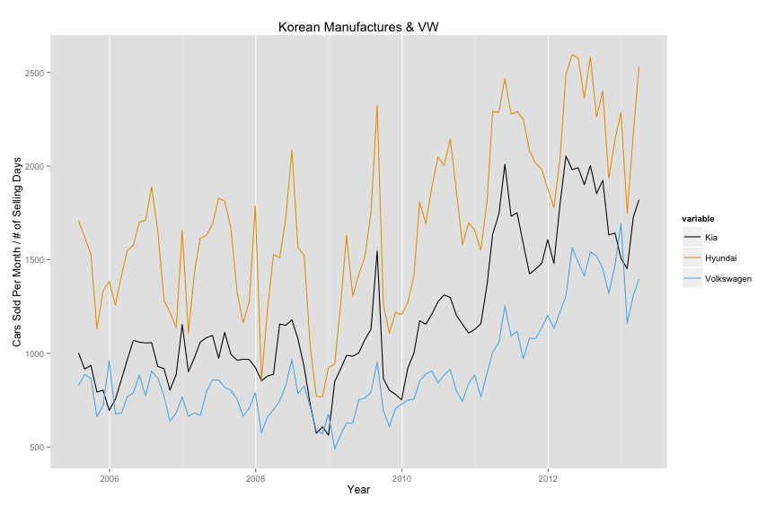
Obviously Kia and Hyundai should be graphed together. I included VW since it looked similar enough and has been targeting US market specifically with poorer quality (cheaper) Passat. All three haven't been significantly effected by general decline due to economy and they've all increased since 2009.
Lexus is biggest Japanese Luxo brand while Acura and Infiniti are far behind.
With all


Car and Driver has Terrible Infographics


Take a look at this info graphic.
The data include car sales of Ferrari, Lambogini, and Maserati for the years 2010,2011,2012 for Italy. This is obviously a time series plot but the graphic designer thought for some reason that the graphic should be a bar chart, half circle, and half of the picture should be upside down. Why not just have something like this?
I know my graphic has half years (which don't mean anything) and the labels for car manufactures are cut off. I still think its a more informative graphic than the one C and D produced. What do you think?

Thursday, April 4, 2013

EVO Data Continued

My previous post attempted to see whether higher revving cars are more likely to score higher on EVO tests (and therefore add some quantitative justification to my suggestion that higher revving cars are more fun). I used an ordered logit model because of the categorical nature of the EVO 5 star rating system. Here I will simplify the analysis by using a logit model and combine the 5 star ratings into 2 different ratings. This should simplify the analysis and assumptions involved (EG, that all the coefficients are same throughout the ordered logit model).

First, I separated the 5 star data into two different groups; those that are 4.5 or 5, and those below 4.5 (4, 3.5, 3, 2.5). One benefit of separating the data into these two groups is that they are roughly equal in size (134 (46.9%) for those >=4.5 and 152 (53.1%) (<4.5). These results are shown in Model 1.


Then, I separated the EVO star data into whether the car had the coveted 5 stars or not. There are 63 (22%) observations with 5 star rating and 223 (88%) without. These results are shown in Model 2.

The conclusions are fairly similar to my previous findings, that higher revving, low torque engines are more EVO worthy cars.


Greater than or equal ato 4.5 EVO Rating Cutoff Point Model

Below is a pairwise correlation plot of the variables. I've included an indicator variable to determine whether the car is naturally aspirated or has some sort of forced induction which was not in my previous analysis. All the variables showed some level of right skewness and therefore all variables were logged transformed.


GRAPH 1

Price is slightly skewed to the right. This makes sense given that we have a few vary high priced cars (max was 2 million pounds). Engine size (CubicCenti) has a bimodal distribution because of the high number of cars that have 2.0 liter engines. Interestingly, RPM where max LBFT is achieved (ftrpm) is also bimodal. The cause of this bimodal distribution appears to be due to whether the engine is has a forced induction (including turbo or supercharged). One can see (at the intersection of ftrpm and Induction) that those that are naturally aspirated have a higher RPM where maximum torque is achieved. Finally, Weight is skewed to the left. This is due to EVO testing a large number of track cars (Morgan's, Caterhams, etc.) that are very light weight. (I was thinking of removing these light track cars from the analysis because these aren't REALLY cars. But then I had the good luck and privilege of having a ride in a Morgan three wheeler at a jalopnik.com event. Being a passenger in the car while the driver was drifting in downtown Manhattan convinced me to leave these wonderful cars in the analysis.)

To fit a model, I included all variables in a logistic regression and used a stepwise regression teqhnique with an AIC criterion. The resulting model is below. 

MODEL 1
Coefficients: Estimate Std. Error Z - Score P Value
(Intercept) -28.51 13.46 -2.12 0.03
Price.1 1.33 0.40 3.34 0.00
hprpm 3.26 1.34 2.43 0.02
lbft -1.76 0.67 -2.62 0.01
X0.60mph -2.84 0.93 -3.04 0.00
Price and RPM where maximum Horespower is achieved are positively associated with EVO score. Interestingly, torque is negatively associated with EVO score. Finally, as we would expect, 0-60 time is negatively associated with EVO score (having a lower 0-60 score means its a more "EVO appropriate" car). This model results in correctly classifying 75.5% of the observations. 


That torque comes in negative and HP RPM comes in positive both suggest that higher revving, low torque cars are more EVO worthy cars. 

5 Star EVO Model

Below is a pairwise plot for the variables. The plots on the bottom row and the right most column are the only difference the graph below and the graph above.

GRAPH 2

All of comments from the GRAPH 1 apply to GRAPH 2. The relationships between this cutoff method and other variables appear to be similar to those relationships between the first cutoff method and other variables. The same method of stepwise logistic regression was used to fit the model shown below. 

MODEL 2
Coefficients: Estimate Std. Error Z - Score P Value
(Intercept) -10.4832 5.586 -1.877 0.060561
Price.1 0.4135 0.2614 1.582 0.11369
ftrpm 1.4126 0.4151 3.403 0.000666
X0.60mph -4.7284 1.0398 -4.547 5.43E-06

Price and RPM where Torque achieves its maximum (FTRPM) are both positively associated with 5 star EVO cars and 0-60 time is negatively associated. While torque is not statistically significant in this model, FTRPM is. Therefore, similar conclusions are reached about my original hypothesis, but not as strongly as Model 1. Model 2 correctly classifies 86.5% of the observations.

Conclusion:
Both Models suggest that higher revving cars are more likely to achieve a higher EVO score. Torque is negative in first model (controlling for other factors) and adds evidence that high torque isn't obviously beneficial. However, the second model does not include torque as statistically significant so it isn't as conclusive as higher RPM cars have higher EVO scores. While HP RPM is used in Model 2, LBFT RPM is used in Moded 1. I don't think this is a big deal since they are highly correlated (correlation coefficient is 0.745) and it's not surprising that one doesn't come in statistically significant when the other does.